


visual Identity | PackaginG
Night Stars
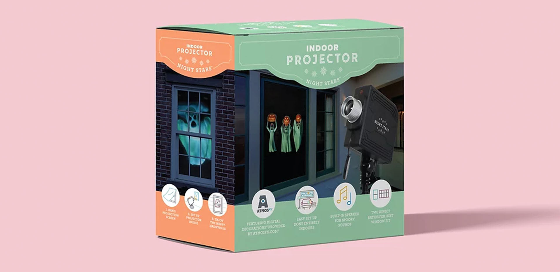
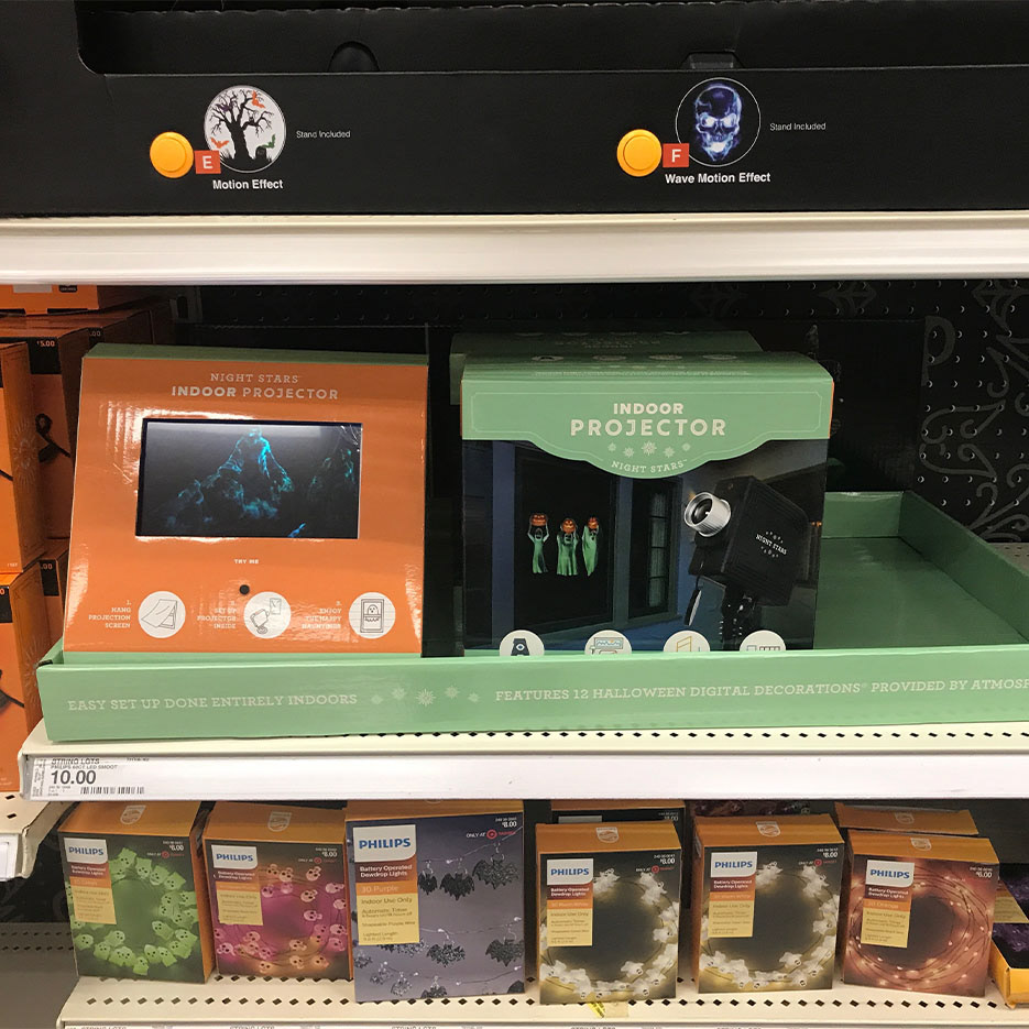
As one of the first holiday landscape lighting brands on the market, the visual identity of Night Stars began to look dated. During a pitch at Target, it was noted how the design did not fit in with the other seasonal home goods products. The visual identity needed to move away from a hardware store-utility look in order to get in at the right retailers.
Embracing Holiday Cheer
The updated design is lighter and colorful. The light green was updated as the main brand color with a secondary color signifying the holiday theme: red for Christmas and orange for Halloween. The layout of the packaging was maintained for consistent branding, but the information icons updated to more modern, monoline illustrations.